Spot illustration 3 of 7 for “The Big Green Guy” article in Starlog #180, July 1992. Here Godzilla employs a most devious weapon against Mechagodzilla. (Mechagodzilla is my favorite enemy out of all the Godzilla movies.)
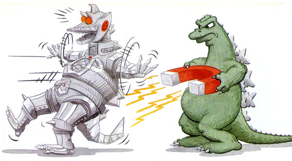

Spot illustration 3 of 7 for “The Big Green Guy” article in Starlog #180, July 1992. Here Godzilla employs a most devious weapon against Mechagodzilla. (Mechagodzilla is my favorite enemy out of all the Godzilla movies.)

Gort was the stoic robot from 1951’s “The Day the Earth Stood Still.” It spent most of the movie standing motionless in front of the flying saucer it arrived in.

Robby the Robot originally appeared in the 1956 film “Forbidden Planet.” He was a very iconic character that made many appearances in movies and television shows in the 50’s, 60’s and 70’s. I often mistook the Robot from “Lost in Space” for Robby. I just learned that they were both designed by the same person, Robert Kinoshita.

The editor of Starlog, David McDonnell, held on to this cartoon for quite a while before publishing it. I submitted it in February of 1992. The centerfold is the robot Maria from the 1927 film “Metropolis.” For you non-Trekkies, Data was the android Second Officer of the Enterprise in “Star Trek: The Next Generation” who was always trying to develop his humanity and human emotional experience.

This cartoon was done early on in my experimenting with Berol Prismacolor Art Markers. Prior to this I had been using transparent acrylics and was looking for a faster method. I eventually went back to the acrylics, but I still use the same set of markers to this day. I did have to replace a few much-used colors recently but most are still in good working order after 22+ years.

Tribute cartoon done after the passing of Isaac Asimov on April 6, 1992.

I’m working on a new project creating robot spot illustrations for a series of computer programming books for kids and teenagers. This is my first paid client job that I am creating entirely digitally. Pencils and inking brush are from the Frenden Photoshop tool set.

This is one of the initial robot designs. I began by sketching about 50 ideas very roughly in blue pencil – the image on the left is from that initial set. I find this process very relaxing and fun, just letting my mind go crazy coming up with silly ideas. Most are pretty awful but you get a few good ones. Working on the tablet is actually very fluid. I liked the shape of the body and head but decided to get rid of the cranial peripherals in the tight pencil sketch on the right.

Working on a final piece starts with a rough blue line sketch.

Tight pencil sketch for client approval.

Final inks. This is the hardest part of the process as I am rather picky about the quality of the line. I do most of the inking with a digital brush because I like the thick and thin qualities and I don’t want the image to look like it was created on a computer. I want a tight, clean image, but I also want a hand-drawn feel. Unlike working on paper, on the computer I can zoom in on detail sections which can make me a little nuts when I see all the little imperfections. I got frustrated on my first robot drawing and decided to try it on paper with brush and ink. I scanned it and compared it to the digital version and realized the one done on paper was actually rougher than the digital version.

Final colored image. At first I tried coloring the original digital file but found that dropping colors in with the bucket left an anti-aliased halo. Coloring on a layer beneath was overly time-consuming. I decided to convert the ink layer to a 600 dpi bitmap, then reconvert to RGB. This leaves a sharp, pixelled edge around everything which allows for dropping in color with no halo. Once the image is shrunk down for print the pixel edge all but disappears.
| victorhugobrazil on Starlog #204 July 1994 | |
| body of water on The Big Green Guy | |
| The Pencil Hoarder on Comics Scene #41, March 1… | |
| Paul S on Comics Scene #40, February… | |
| M.Kirby on Unpublished Starlog Cartoon… |
